I rolled my own slide deck. Wasn't the best plan, it's really quite janky!
Click to toggle the or hover your cursor down to the bottom-left and click the Slideshow button there.
There's another hoverable button bottom-right for toggling light, dark and auto modes.
Otherwise browse around with your arrow keys and enjoy the jank!
It was made to look best at a 16:9 aspect ratio.

why not both? 🤔

a.k.a. Light mode Vs Dark mode.

Or, why building both dark and light schemes together is easy, actually.

hello! 👋

a cartoon avatar of me by Andy Carolan

Sara here. I'm both:

  • an old hand 👌
    (built websites as a teen from 1999)
  • and a newbie 🤯
    (switched career from small-company
    general engineering into web dev in 2022)

a warning

There'll some movement, animation, and abrupt changes between dark and light modes in this presentation.

If you suffer from migraines, epilepsy, or strong astigmatism
- I'm really sorry! 😓

My hope is that with the information I'm about to present, browsing the web will get ever more comfortable for everyone.

dark mode vs. light mode

We all love a good polarising argument!

But there are physical reasons to prefer one over the other.

Also, you're allowed to like light or dark themed websites better, for no good or logical reason!

Your eyes, your choice! 👀

why dark mode?

Pupils constrict when coming across a bright page.

Too much contrast with dark surroundings.

Floaters appearing and distorting or blocking vision.

A recreation of how floaters look in vision. Another recreation of how floaters look in vision. Yet another recreation, including text 'People with severe floaters struggle to read text like this.'

why light mode?

Pupils constrict when coming across a bright page!

It's easier to focus when your pupil is smaller.

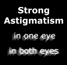
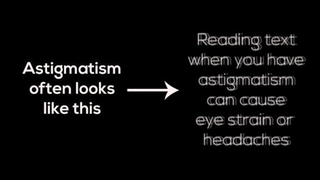
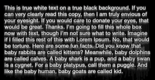
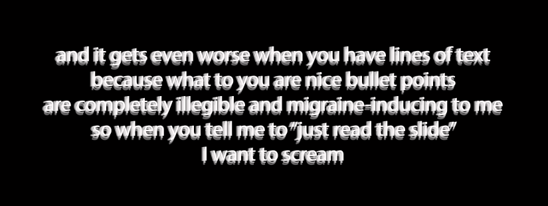
Astigmatism makes light text on dark backgrounds hard to read.

Astigmatism makes light text on dark backgrounds hard to read.

Recreation of dark mode showing the effects of strong astigmatism in one eye and in both eyes. Another recreation of astigmatism in dark mode. Another recreation of astigmatism in dark mode. Another recreation of astigmatism in dark mode. Another recreation of astigmatism in dark mode. Text 'I am the douche bag who makes people read white text on a black background.' Text 'I am the douche bag who makes people read white text on a black background.' - this time distorted.

why not both?

GOOD QUESTION!

Both!

Both.

Both is good.

*nods*

Miguel and Tulio from The Road to El Dorado waggling their eyebrows at each other.

this talk's scope

Includes:

  • Having your site react to prefers-color-scheme.

Does not include:

  • Manual toggling of colour-scheme.

Very possible, with a bit of JS! But let's keep 🪱🪱🪱 ➡️ 🥫

starting from scratch

No styles, no problem!

However...

Building this into a mature site or design system may be tricky.

Harder still if everything already has specific colours assigned.

Keep it in mind for the next time that you start a new project 🌱

default HTML themes

Website name

Blog title

Blog post title

Blog post content

Comments

First!
Great post!
Very informative!

Copyright Me, 2024

What a nice form!


Website name

Blog title

Blog post title

Blog post content

Comments

First!
Great post!
Very informative!

Copyright Me, 2024

What a nice form!


color-scheme

You don't even need CSS for this!

	<!-- in HTML -->
	<head>
	  <meta name="color-scheme" content="light dark">
	</head>
	/* In CSS: */
	:root /* or html */ {
	  color-scheme: light dark;
	}

system colors

Hellooooooo!
How are you?

You can apply color-scheme to most elements.
But - they need to be assigned both a color and background-color first.

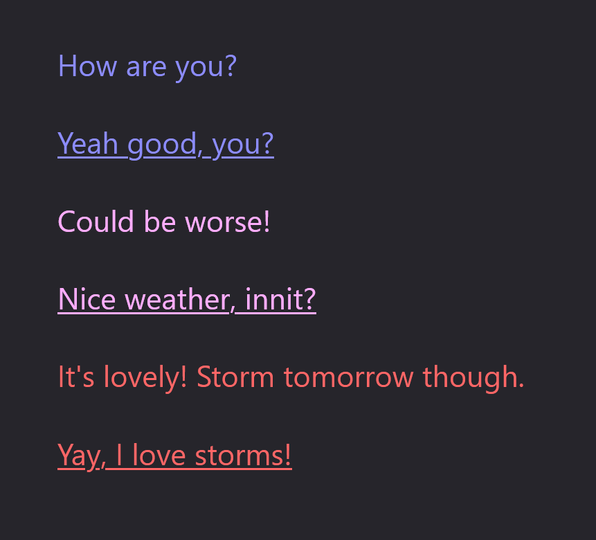
other system colors 🙄

How are you?

Yeah good, you?

Could be worse!

Nice weather, innit?

It's lovely! Storm tomorrow though.

Ooh I love a good storm!

screenshot of the same slide on FireFox

contrast too high?

Those implementing WCAG for accessibility may find it unlikely.

But some migraineurs do have trouble with this!

Alongside prefers-color-scheme there is also
prefers-contrast.

The simplest way to bring contrast down is with
filter: contrast().

bringing down contrast

Hellooooooo!
How are you?

Ahh thanks, this calms my eyes and brain.

other colours

How are you?
Yeah good, you?

Could be worse!
Nice weather, innit?

It's lovely! Storm tomorrow.
Ooh I love a good storm!

prefers-color-scheme

This follows OS preference,
not color-scheme property.

How are you?
Yeah good, you?

Could be worse!
Nice weather, innit?

light-dark()

Not yet in all browsers,
but soon - so exciting!

How are you?
Yeah good, you?

Could be worse!
Nice weather, innit?

in summary

Use color-scheme: light dark;

Use color-mix() when adding colors

Support user contrast preferences

Look forward to light-dark()!

Experiment and play :)

takeaway: offer choice

light mode dark mode
more contrast Hi! Hi!
less contrast Hi! Hi!

further reading

Do you know color-scheme? by me

Improved dark mode default styling with the color-scheme CSS property and the corresponding meta tag by Thomas Steiner

What I've learned about CSS color-scheme and friends.
by Apple Annie

Color-scheme Tinkering on codepen, by me again

CSS color-scheme-dependent colors with light-dark() by Bramus

thank you!

I'm so honoured to be taking part in the 11ty Conference!

Huge thanks to the 11tyConf Crew: Zach, Olivia, Mike, David and captioner Diane.

🙏💖🎈

🏠 sarajoy.dev
👋 @sarajw@front-end.social